Initial Thoughts
In this project I chose to redesign redesign Tally Hall's "Marvin's Marvelous Mechanical Museum" album.  Tally Hall is a weird early 2000's band that I enjoy and since they don't have many albums I thought I can design something fun without having a strict template to work off of. In this album their song "Ruler of Everything" is my favorite so I designed the cover mainly off that song and my take on the soundtrack.
Research
I focused on themes that I wanted to represent when making my cover for Tally Hall's Album. I focused on illustrative style as that is how I originally intended my albums graphics to look like. I also looked at various ways CDS were designed I could look into.
Sketches
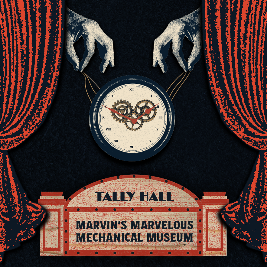
I already had a set idea of what I wanted to illustrate for the cover. There is a line in "Ruler of Everything" about mechanical hands being the ruler of everything, so I staged the cover as a puppet show. Most of my sketches are me experimenting with image and type so I knew how to place it better when rendering it. These sketches also helped how I would make my poster by seeing how much can I make it different yet similar to my album cover.
Designs
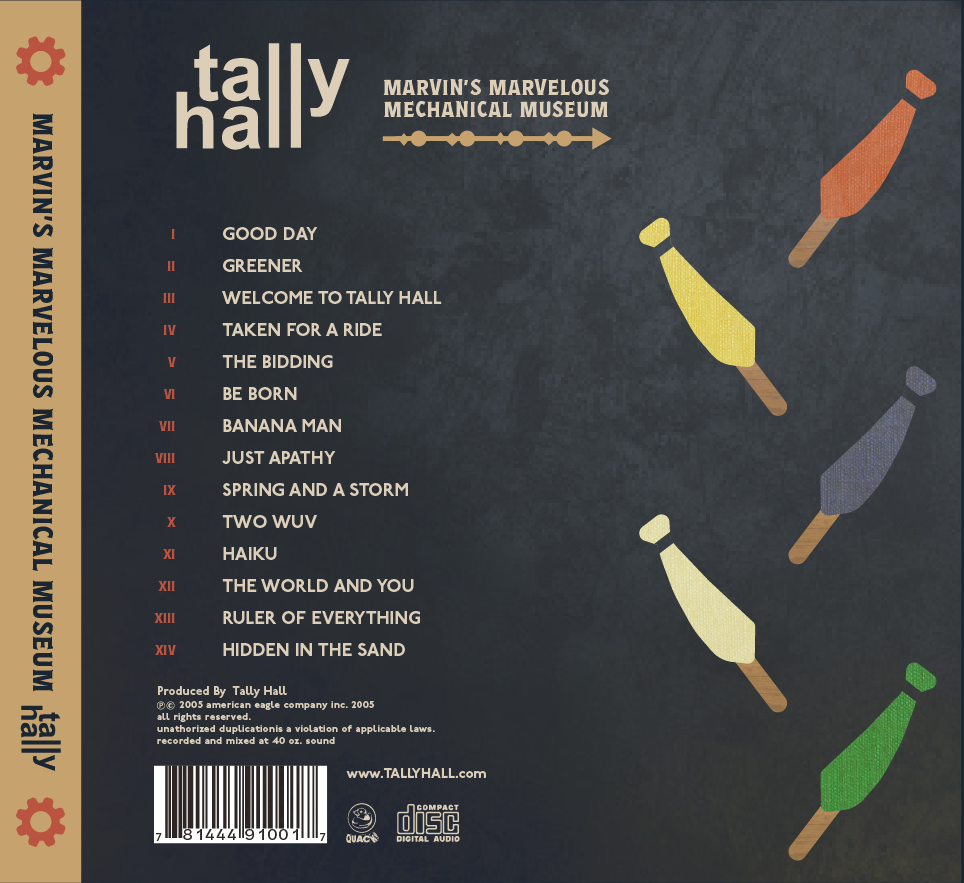
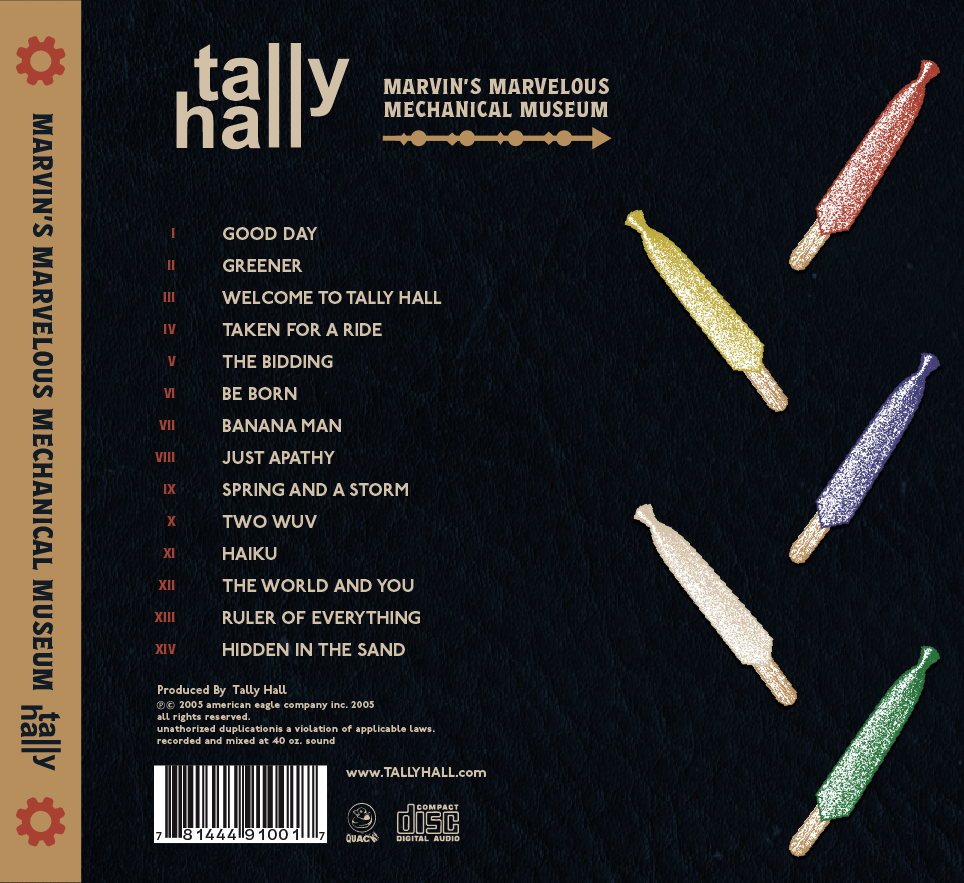
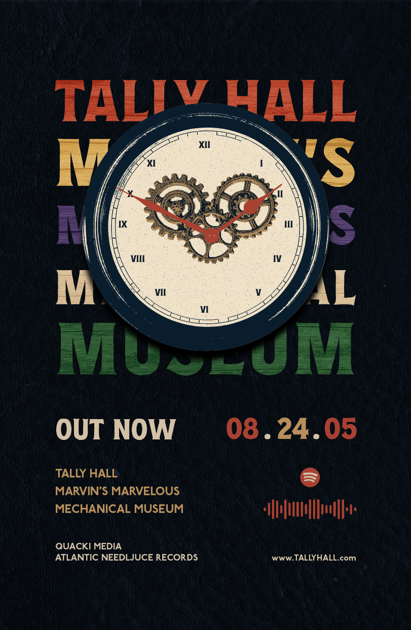
In the original version of this project, I used an illustrative style. When I revisited this project, I decided to experiment with a collage style. The original cover featured the band surrounded by a collage of illustrations that built the world the album lived in. Given the strength of that concept, I thought it would be interesting to explore how the same ideas could be expressed through different artistic styles. This exploration not only allowed for creative flexibility but also added a layer of depth to the overall presentation, making the comparison between styles an exciting aspect of the project.
Album Cover Illustration Ver.
Album Back Cover Illustration Ver.
Poster Illustration Ver.
Album Cover Collage Ver.
Album Back Cover Collage Ver.
Poster Collage Ver.
Poster Collage Ver.
Print Mockup
To not make the CD or poster crowded as if I were to replicate it like the album cover, I liked my idea for using type as part of the illustration. The album title is long so it will take enough space and I could play with the colors just as the original band liked to do. 
Illustration Ver. Mockup
Collage Ver. Mockup
Collage Ver. Mockup
Reflection
This was one project I tried to immerse myself in. I had a set idea so it was on me to get the theming right. This project also challenged me in how production parts of albums such as copyrights and the barcode are considered when designing an album cover. I got to play with size and space a lot and understand which parts are essential and what help the overall design. This was fun to revisit and try to take the theming to a different level.
Back to Top