Project Description
This was a collaborative effort to redesign the branding for Santa Clarita's Heritage Junction. This was a class project of our team acting as our own mock agency deciding the roles, work effort, and direction with input from a mock client.
Team
Ivan Ceja-Diaz, Brandon Melchor, Olivia Salmon, Sammy Schreier
Ivan Ceja-Diaz, Brandon Melchor, Olivia Salmon, Sammy Schreier
Project Concept
Rebranding for Heritage Junction
Rebranding for Heritage Junction
Description
In the scenario of the National History Museum acquiring Heritage Junction, the museum foundation wants to rebrand Heritage Junction and launch a programming schedule that includes annual discovery festivals. The goal is to transform Heritage Square into a cool, thriving venue that celebrates culture through history, art, music, film, and more.
In the scenario of the National History Museum acquiring Heritage Junction, the museum foundation wants to rebrand Heritage Junction and launch a programming schedule that includes annual discovery festivals. The goal is to transform Heritage Square into a cool, thriving venue that celebrates culture through history, art, music, film, and more.
My Role
Concept Ideation, Content Research, Presentation Design, Color Branding and Applications, Mockups
Concept Ideation, Content Research, Presentation Design, Color Branding and Applications, Mockups
Research
I did head to the location myself to get a feel for the environment. The train is the site’s biggest attraction but environmental guides interested me the most. We found out about the chapparal yucca that grows around there. I did try to find it on my trip but found mostly cactus there. We made a collaborative mood board to take both personal and field research and see any patterns emerging. It was also to help pitch ideas to the client to see if any one idea sticks. With feedback we were advised to stay away from western and cowboy theming.
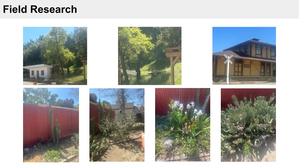
Field Research
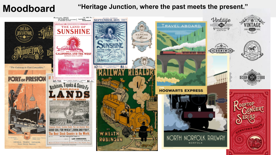
Moodboard
Sketches
We all gave ourselves a chance to pitch our logo concepts to the client. I focused on wordmarks and incorporation of the train.
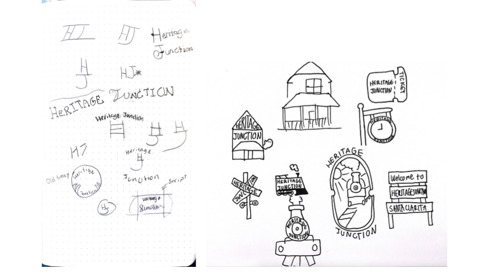
Sketches from Sammy and Olivia

Sketches from Sammy
Logo Sketches: Olivia and Sammy
Rendered Logos
Similarly to the sketches, we also rendered our logos from our sketches. We held a few group sessions to give each other feedback and figure out the next steps for refinement. Pitching to the client the train with smoke was the strongest image but the yucca plant with borders had the strongest potential for a system.
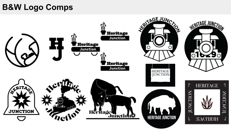
Rendered Logos: Team
Assets and Mockups
After feedback and another team session, we refined the logo and made the rest of the assets. Assets made for the project were a pattern and icon set to be used for a t-shirts and tote bags all put together in a brand guideline. We divided the work again where I was tasked to refine the color and type as well as logo lockups. A few hiccups in the project and I pushed to complete the mockups for the tote bag and t-shirt. I did put all our work together making the brand guidelines using the template the client requested.
Logo
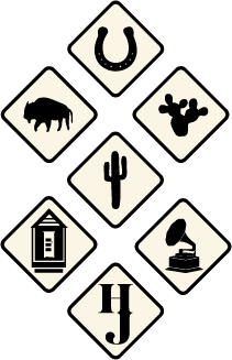
Illustration Style

Pattern
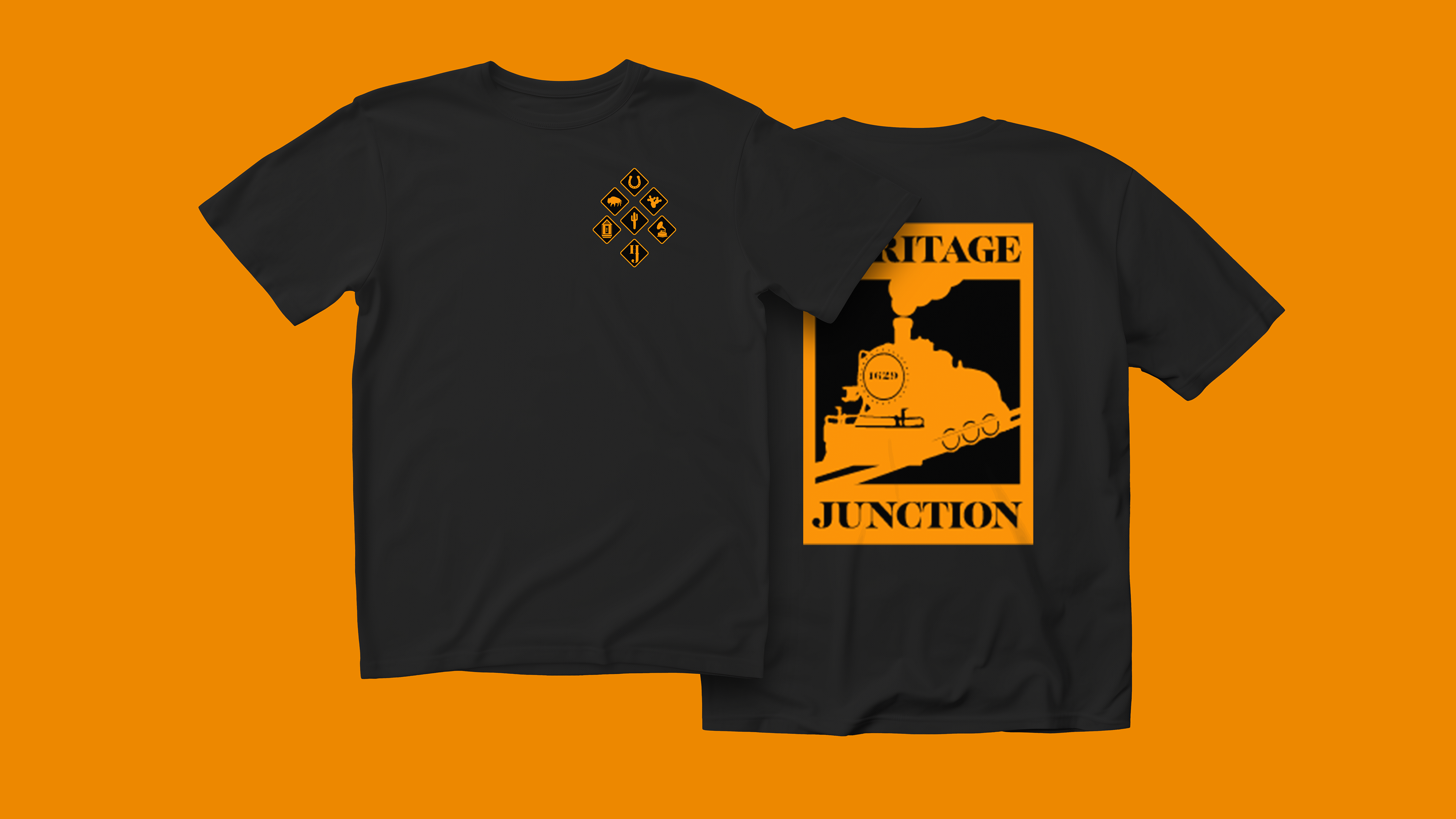
Shirt Mockup
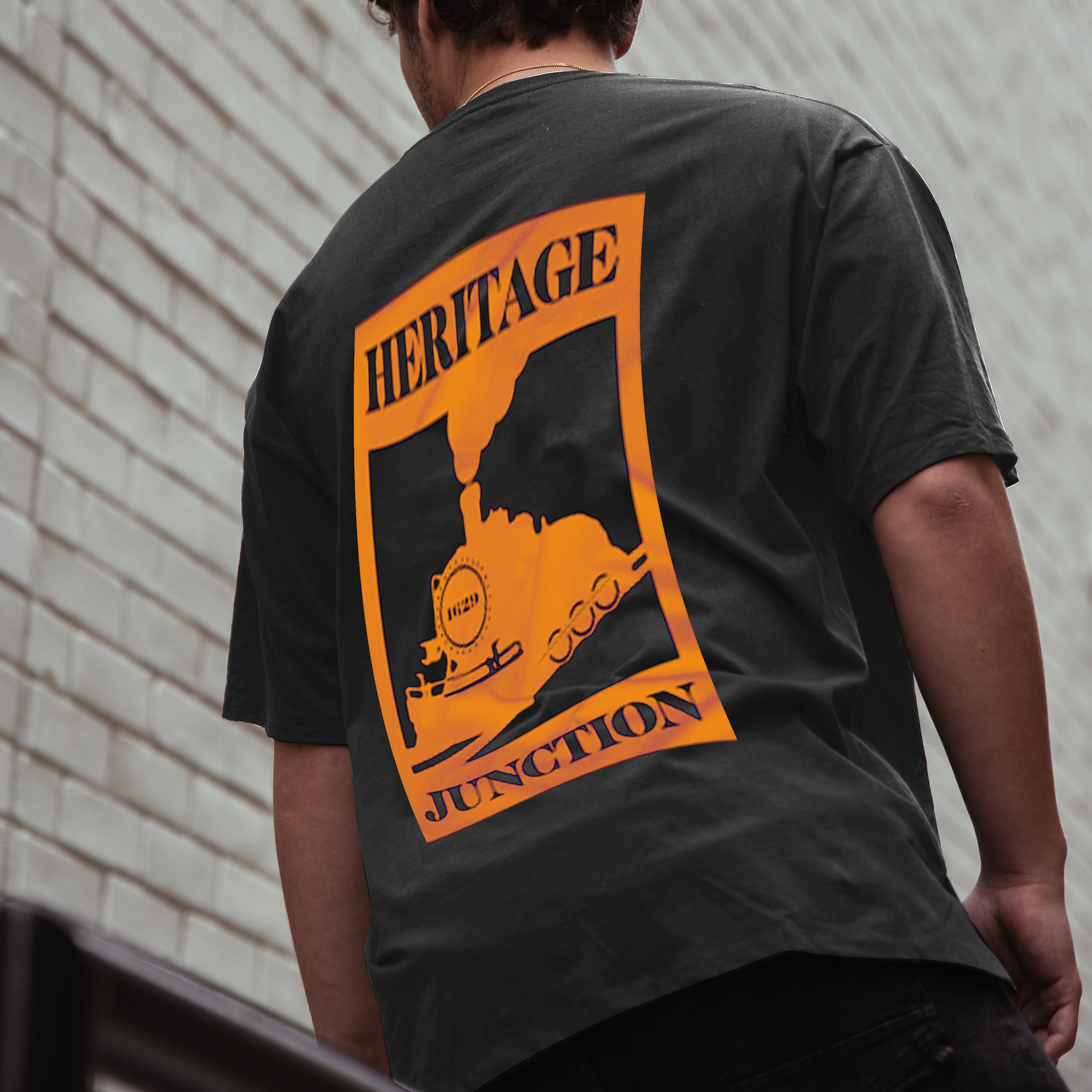
Shirt Mockup on Person

Tote Bag Application 1
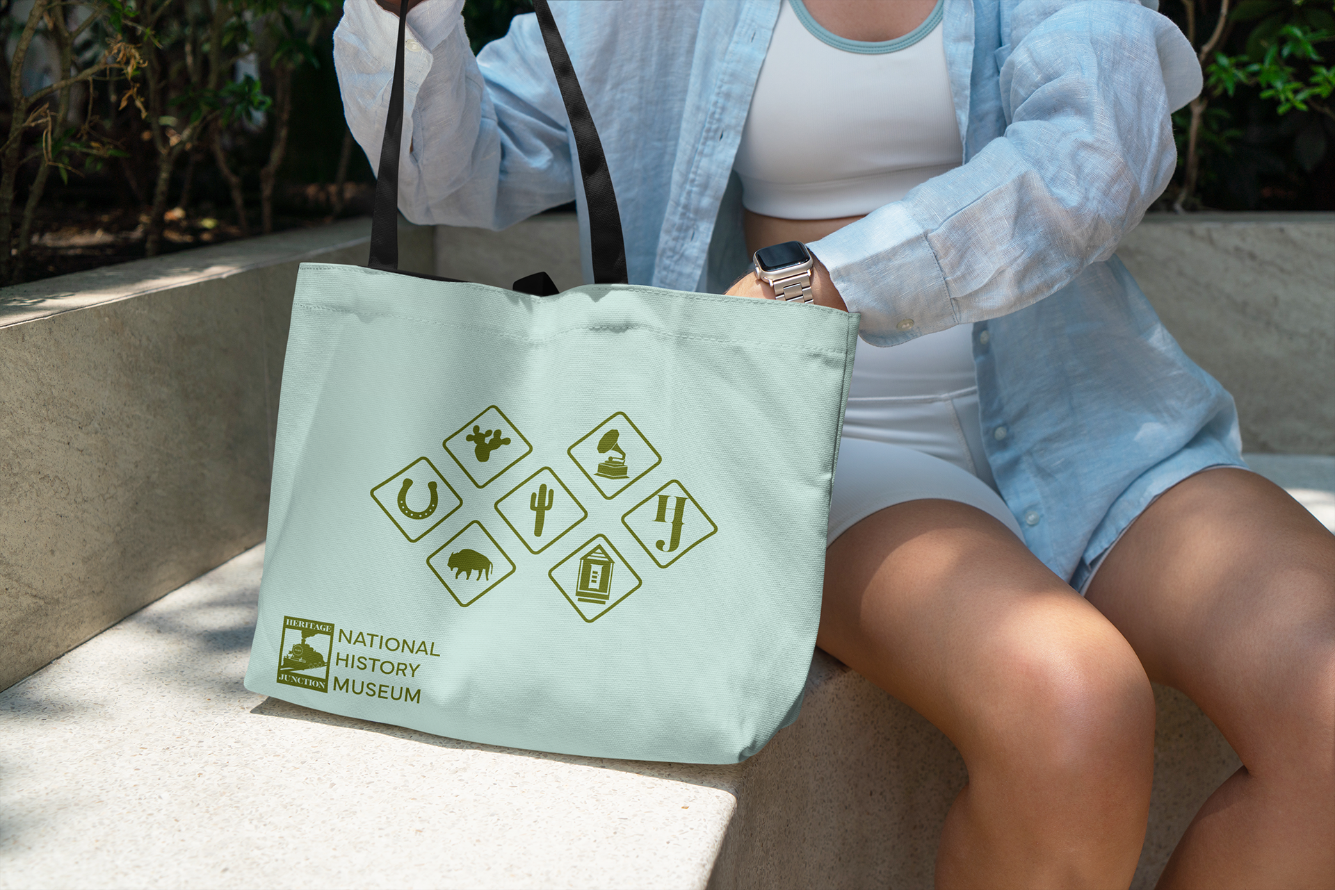
Tote Bag Application 1 Color

Tote Bag Application 2

Tote Bag Application 2 Color
Illustrations: Olivia
Mockups: Sammy
Brand Guidelines
For the guidelines, we divided the work again where I was tasked to refine the color and type as well as logo lockups. A few hiccups in the project and I pushed to complete the mockups for the tote bag and t-shirt. I did put all our work together making the brand guidelines using the template the client requested.
Introduction
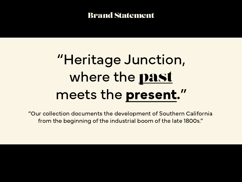
Brand Statement
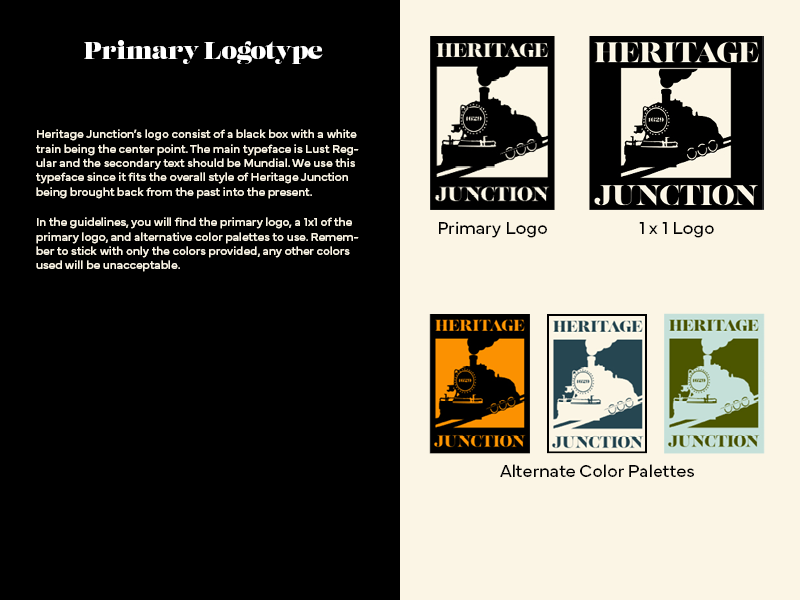
Logotype
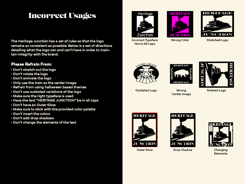
Incorrect Usages
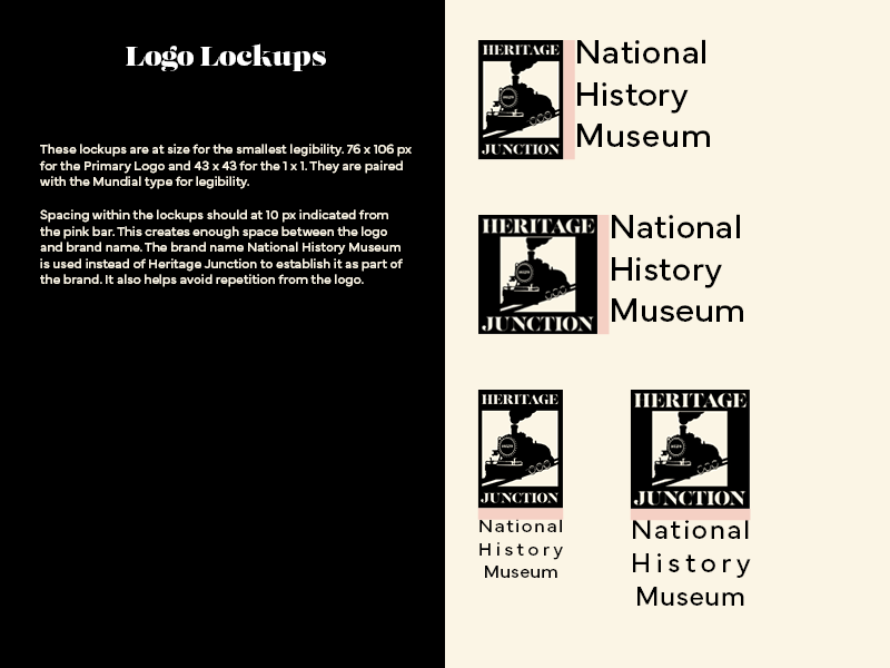
Lockups
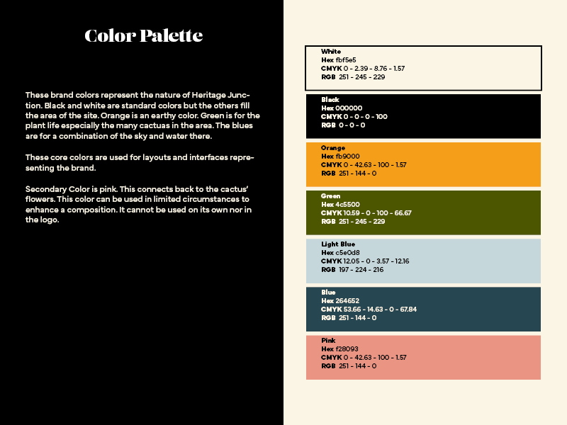
Color Palette
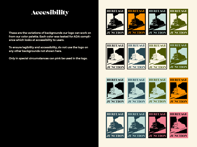
Accessibility
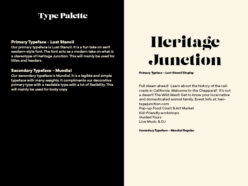
Type Palette
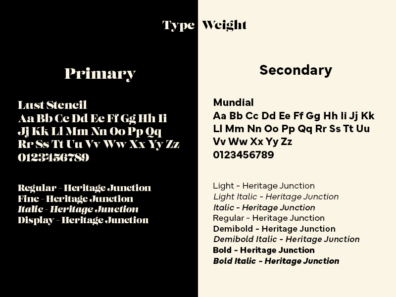
Type Palette
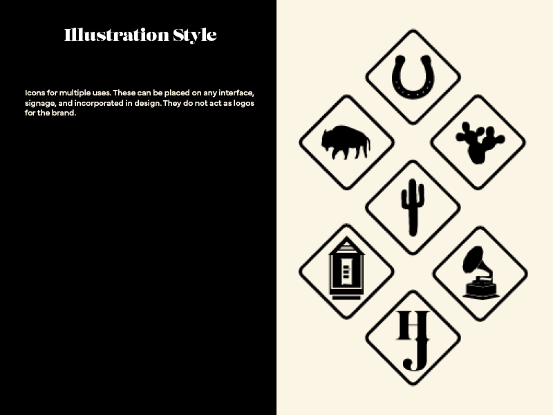
Illustration Style
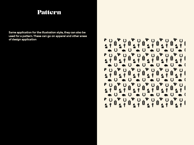
Pattern
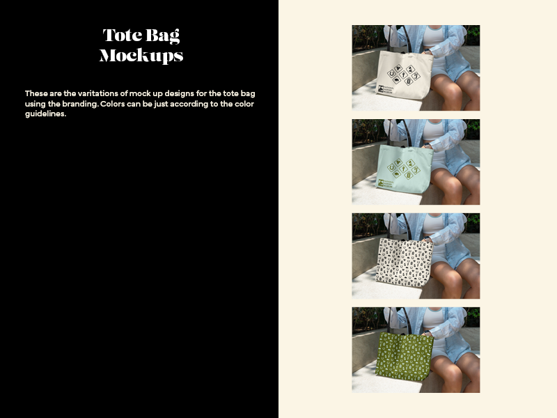
Mockup

Mockup
Logotype, Incorrect Usages: Ivan
Lockup, Colors, Type, Document Design, Mockups: Sammy
Pattern, Illustrations, Logo Design: Olivia
Reflection
This was a great group experience. A lot of us communicated and were learning how to communicate properly in a mock agency. Any vision clashes were addressed professionally and it was a great learning experience for all of us.
